Overview
Copper City Creative is a personal identity project inspired by my hometown, Rome, New York—“The Copper City.” Rooted in craftsmanship and purpose, the brand reflects strength, adaptability, and creative grit. The goal was to design a timeless visual system that honors local heritage while embodying bold modern creativity grounded in authenticity and design excellence.

Challenge
The challenge was to translate deep personal roots and industrial history into a brand that feels modern, versatile, and professional—without losing its soul. I needed to balance symbolism and simplicity, merging tradition and motion into one cohesive mark that could evolve across print, digital, and personal identity applications with consistent visual clarity and meaning.
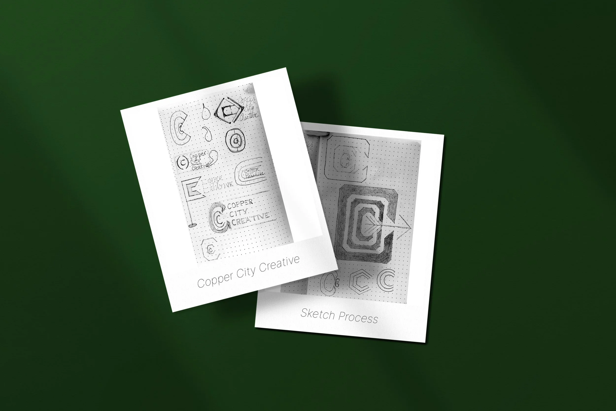
Solution
Through iterative sketching and digital exploration, I developed a logo of three concentric “C” forms in copper-toned Ginger—representing continuity, craftsmanship, and creative expansion. A directional keyhole in Myrtle adds forward energy. Complemented by bold Yankee type, elegant Playfair, and modern Inter, the system unites heritage and innovation through thoughtful color, typography, and geometric harmony.

Impact
The final identity became a cornerstone for my personal and professional brand. It now defines everything from my Webflow site to business cards and client decks—reinforcing trust, clarity, and purpose at every touchpoint. More than a logo, Copper City Creative stands as proof that meaningful design is forged through connection, craft, and intentional storytelling.