

Overview
PaulDan Southwest Realtors sought a logo and business card that linked their Rome, New York headquarters with their expanding presence in Tarpon Springs, Florida. The brand needed to feel coastal yet established, reflecting both the professionalism of upstate real estate and the approachable warmth of the Gulf Coast market.
Challenge
The client wanted to bridge two identities, an established northern business and a new southern venture, under one unified mark. The challenge was to design something memorable that could flex between professional and relaxed environments while conveying regional connection through a simple, recognizable form.

Solution
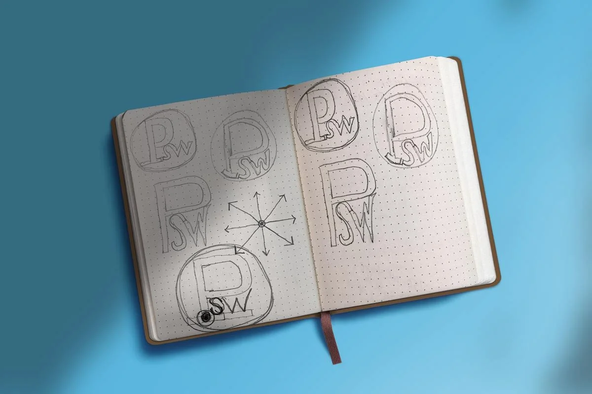
The logo centers on a strong “P” monogram, customized with a carved lower stroke and a red dot symbolizing the southwest point on a map where Tarpon Springs is located. This subtle cartographic nod ties directly to the firm’s name and Florida expansion. A bold blue-and-red palette balances trust, clarity, and geographic storytelling.

Impact
The identity gave PaulDan Southwest a confident, meaningful brand system that resonates across print, digital, and signage. The logo’s conceptual precision and clean design help the firm stand out in both markets, establishing a strong visual link between two states and a single, unified brand story.